Everchron Brand
Logo
The Everchron logo mark must always contain the full image and text mark. The only exceptions to this rule are app icons and favicons.

Optical kerning, refined weight, and defined clearspace, as well as delineated placement in relation to adjacent content all help to make the logo as instantly recognizable as possible at all sizes and in all contexts.
Color & scale

When possible, the logo should always be presented in our primary brand color Vibrant Blue. When placed on top of background images, such as photography or abstract illustration renders, the logo should be white on darker backgrounds and black on lighter backgrounds.
Our logo is designed to scale to small sizes on print and screen.
Smallest size:
- Screen: 20 pixel height
- Print: 0.2 inch height
Clearspace

The clearspace around the logo is equal to the height of the Everchron image mark.
Sub-brands
Sub-brands are distinct products or lines of business geared for particular audiences. They are also used for internal tools and programs. Sub-brands pair the Everchron logo (in Vibrant Blue) with a sub-label set in Inter Italic (in pure black).
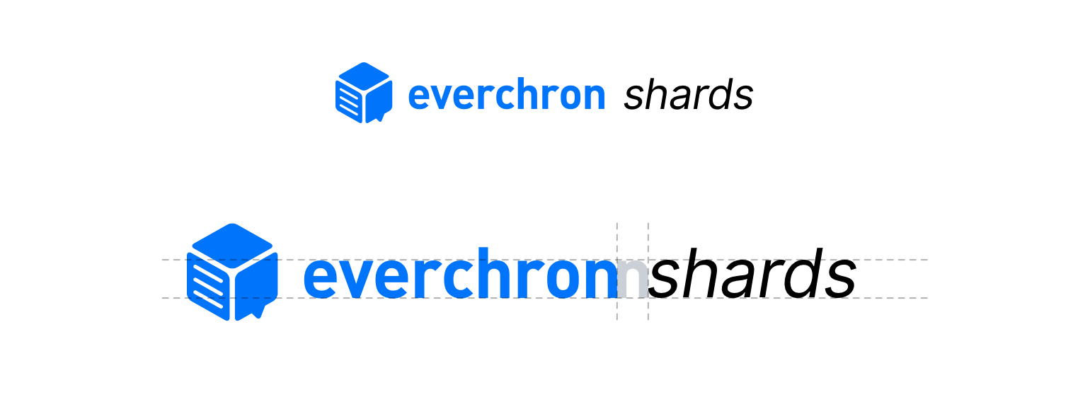
The font size of the sub-brand label must have a matching cap size to the Everchron word mark.
Logo guidance
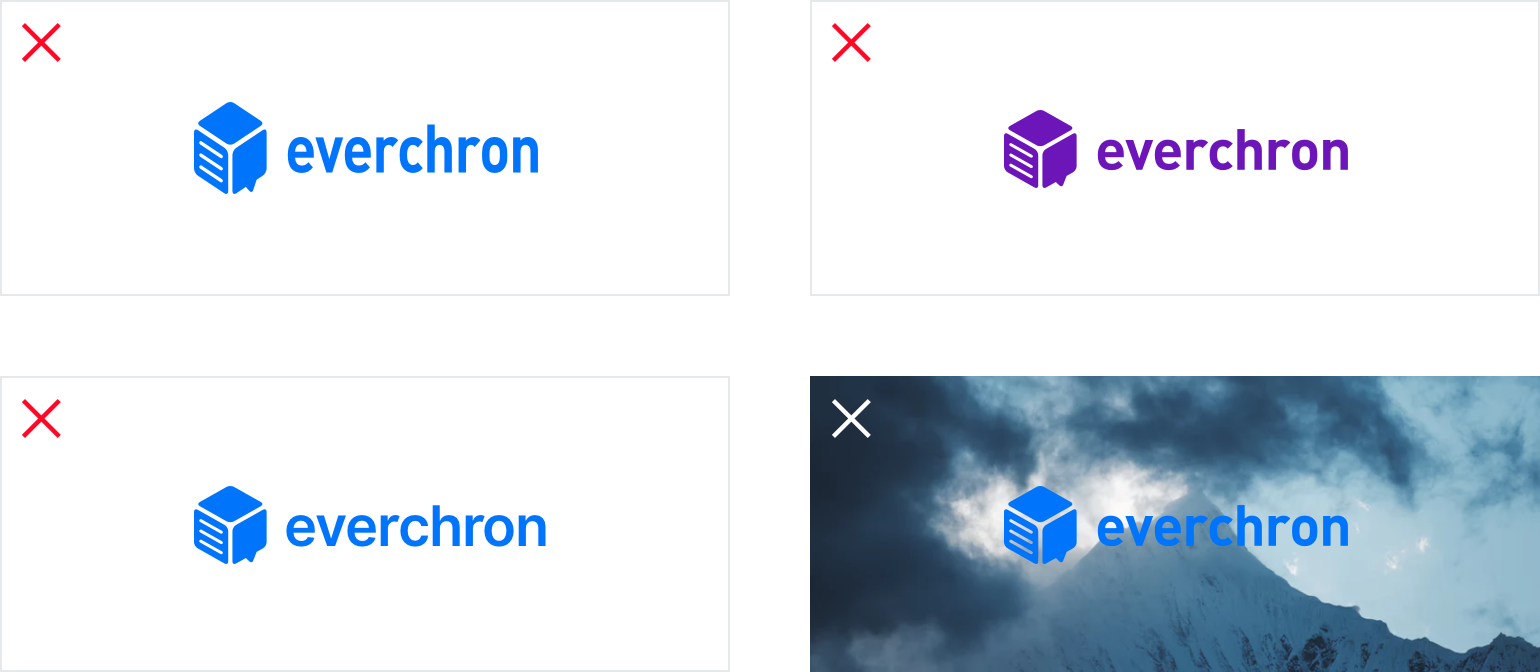
What not to do:
- Do not stretch or squeeze the logo.
- Do not use any colors other than Vibrant Blue, black or white.
- Do not type out the logo in a different font face.
- Do not place the blue logo on top of pictures, or color gradients.
Color
Primary Brand Colors
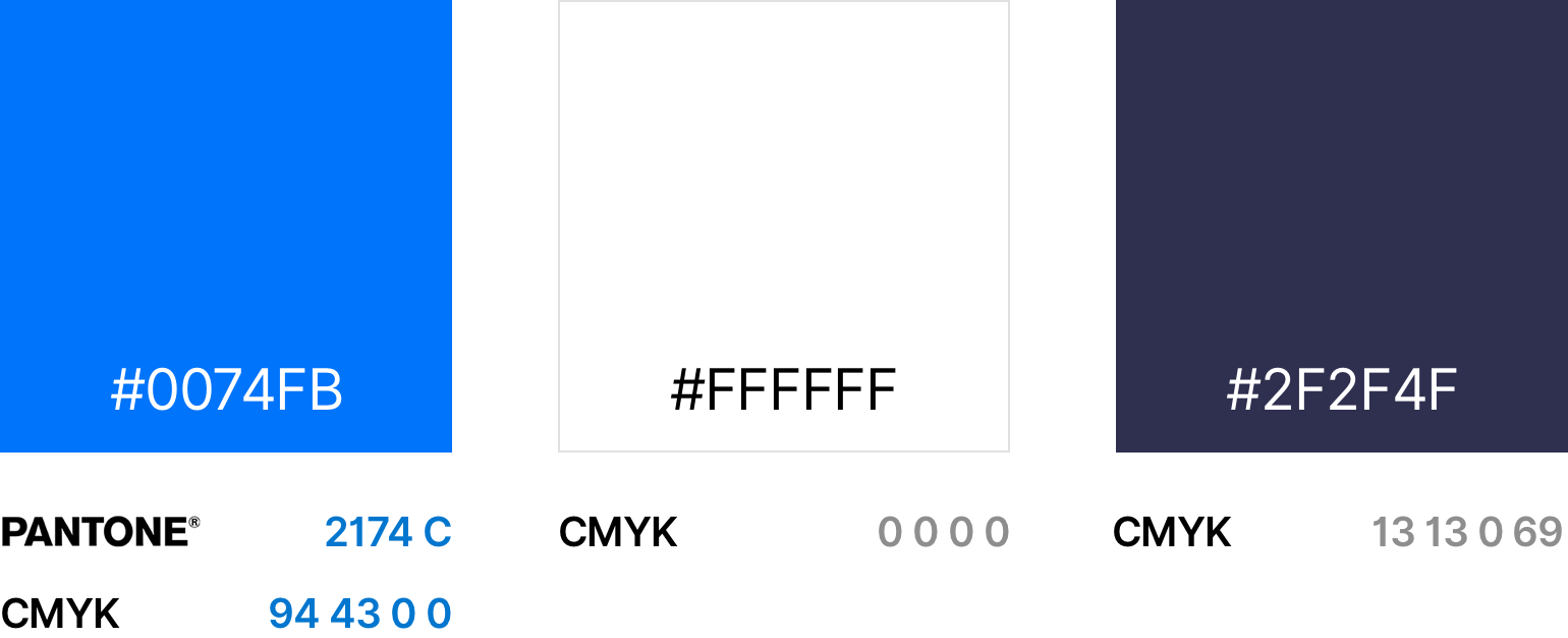
Our primary brand colors are “Vibrant Blue”, “Violet Black” and white. They are used to provide accessibility, simplicity, and consistency throughout our brand communications.
Secondary Colors

Our secondary colors are shades of gray, blue, green and purple.
Product Gradients
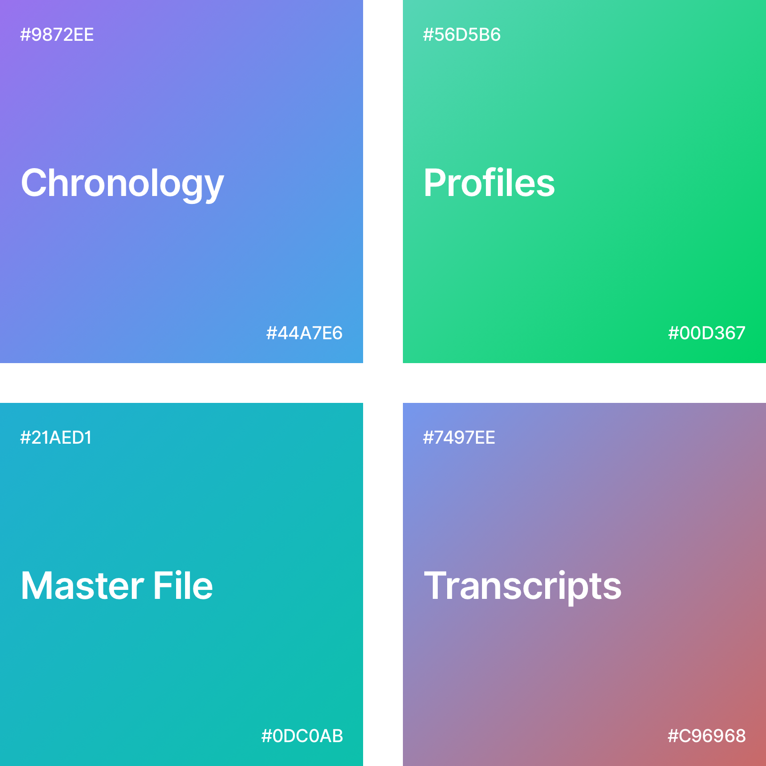
We use specifically-colored diagonal gradients that are associated with our core app functionalities.
Typography
Fonts
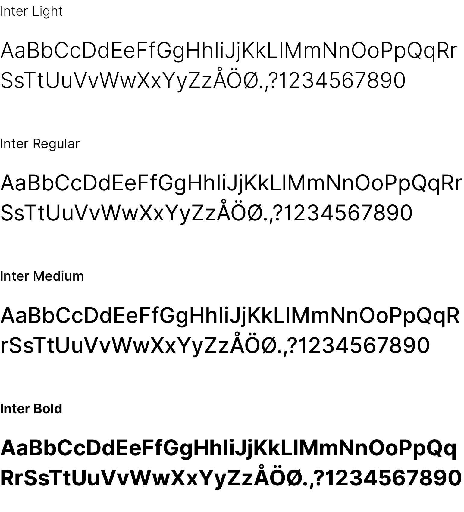
Our primary brand font is Inter (version 3.5). Inter is used for: headlines, subheaders, teaser text, and call-to-action elements. It is never used for longer paragraphs of text or code.
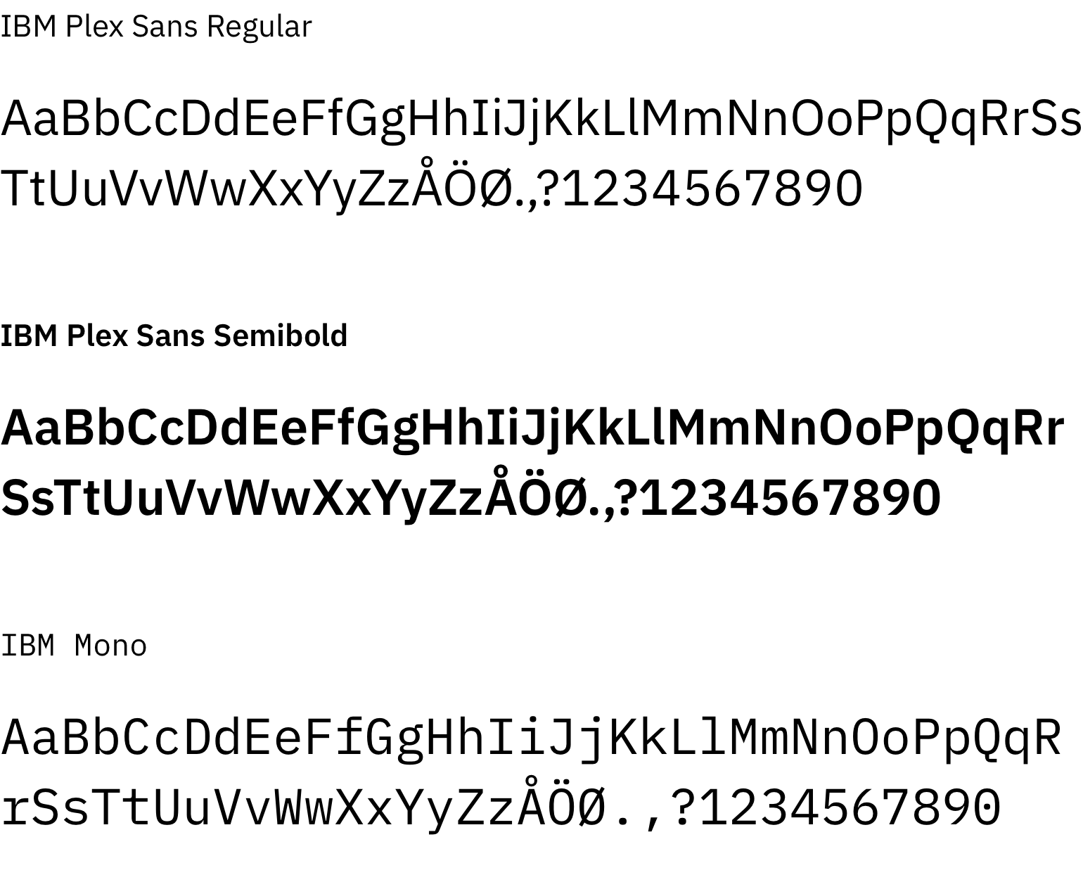
IBM Plex Sans serves as our secondary font. This font is used for long paragraphs of text, both on the web and in print communication. IBM Plex Mono is used for code.
Pairings

It is important to maintain these type pairings. This allows for clarity, consistency, and a strong hierarchy in all brand communications.